Different Chart Views
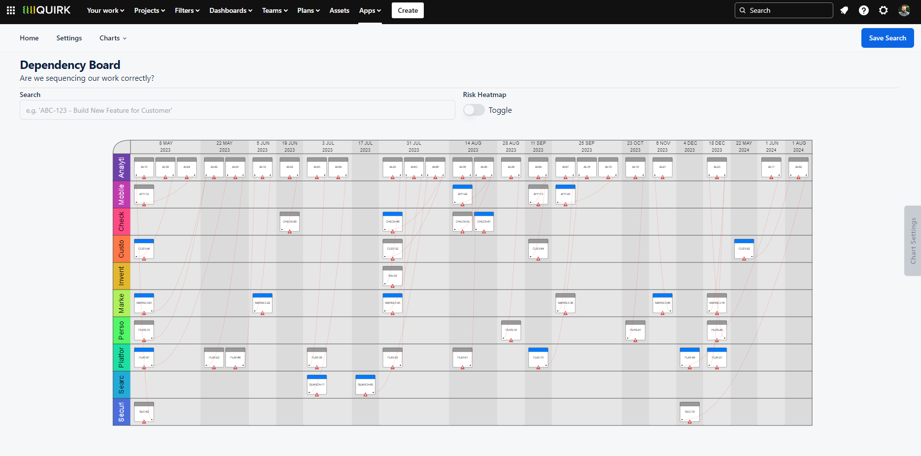
Dependency Board
The Dependency Board presents a comprehensive view of your dependencies in a SAFe-style PI Planning board layout. After running your search, you'll see dependencies arranged with date-based columns and project-based swim lanes, creating an intuitive visualisation of cross-team dependencies.
Navigate the board effortlessly using the zoom feature to focus on specific areas, or use the search function to centre on particular issues. Clicking any issue opens its details in a new tab, allowing quick access to more information when needed.
The Root Cause Analysis toggle adds a powerful analytical layer to your board. This feature overlays a heatmap highlighting areas with high concentrations of dependencies, whether they're raised, received, or total links, based on your selection in the 'Sum of' dropdown.
For real-time customisation, the Chart Options drawer provides quick access to board configuration settings. Adjust your view and see the changes update instantly, helping you tailor the visualisation to your specific needs.
When to Use the Dependency Board
The Dependency Board excels during planning events such as PI Planning, Big Room Planning, or Quarterly Planning sessions. By mapping dependencies against expected completion dates, teams can better understand the sequence of work and identify potential bottlenecks before they become problems.
Teams who regularly use the Dependency Board often make more informed delivery decisions by:
Visualising upcoming work and dependencies across teams
Analysing loaded capacity against planned work
Identifying and mitigating complex dependency chains early
Facilitating cross-team conversations about delivery commitments
Navigate dependencies across teams and time periods with our interactive board view. Customise your visualisation in real time using the Chart Options drawer.
Dependency Matrix
The Dependency Matrix offers a table view of dependencies across your teams, displaying both raised and received dependencies in an easy-to-scan format. Each cell shows the number of dependencies between two projects, and clicking any cell opens a detailed view of all related issues between those teams.
When to Use the Dependency Matrix
The Dependency Matrix is particularly valuable for identifying dependency patterns and hotspots across teams. By highlighting areas with high dependency concentrations, it helps leadership teams spot opportunities to optimise team structures or delivery processes. For instance, if two teams consistently show high interdependencies, it might signal a need to reassess team boundaries or collaboration patterns.
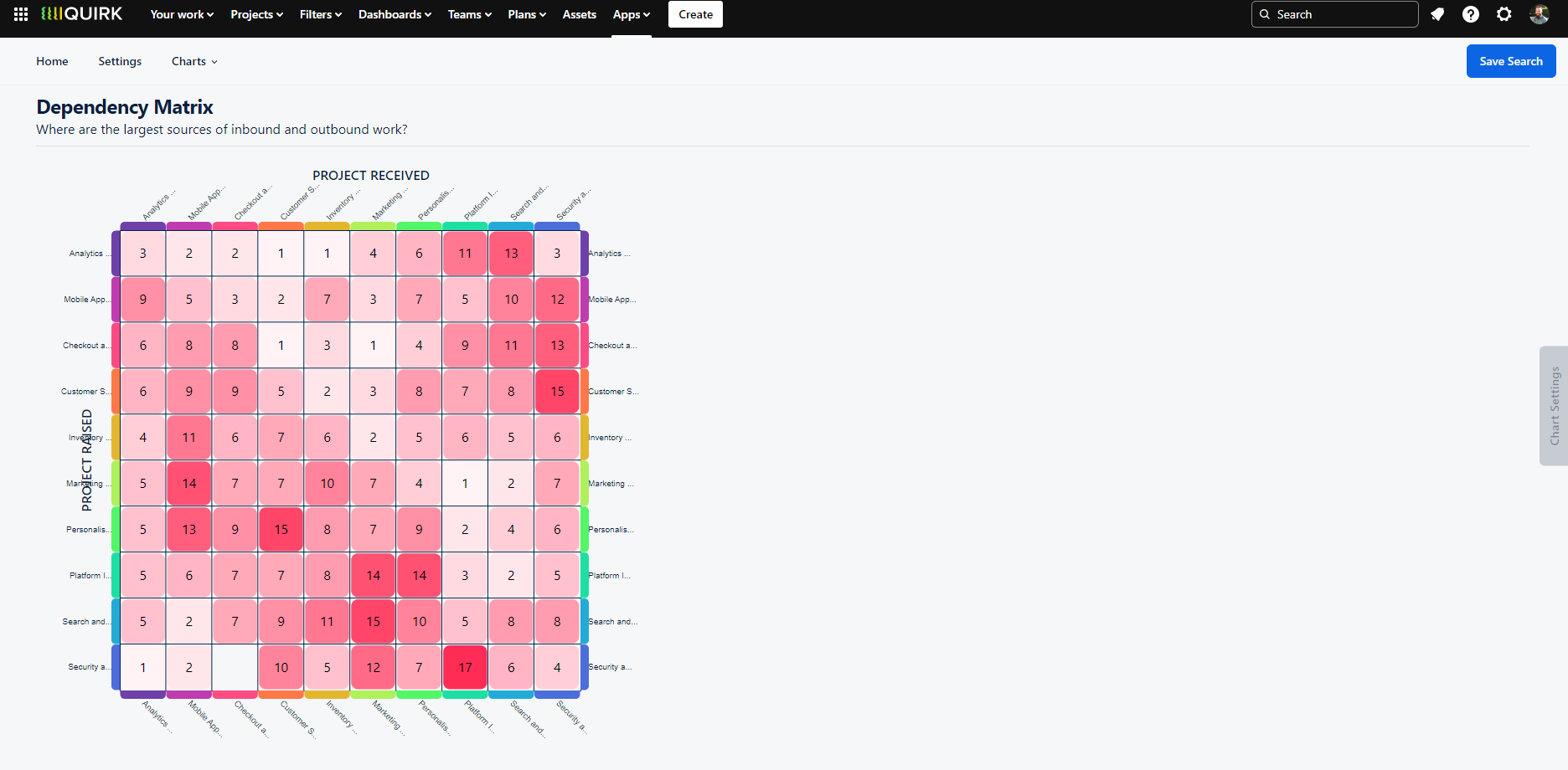
Visualise dependency relationships between teams using our interactive matrix view. Identify collaboration patterns and potential areas for team structure optimisation.
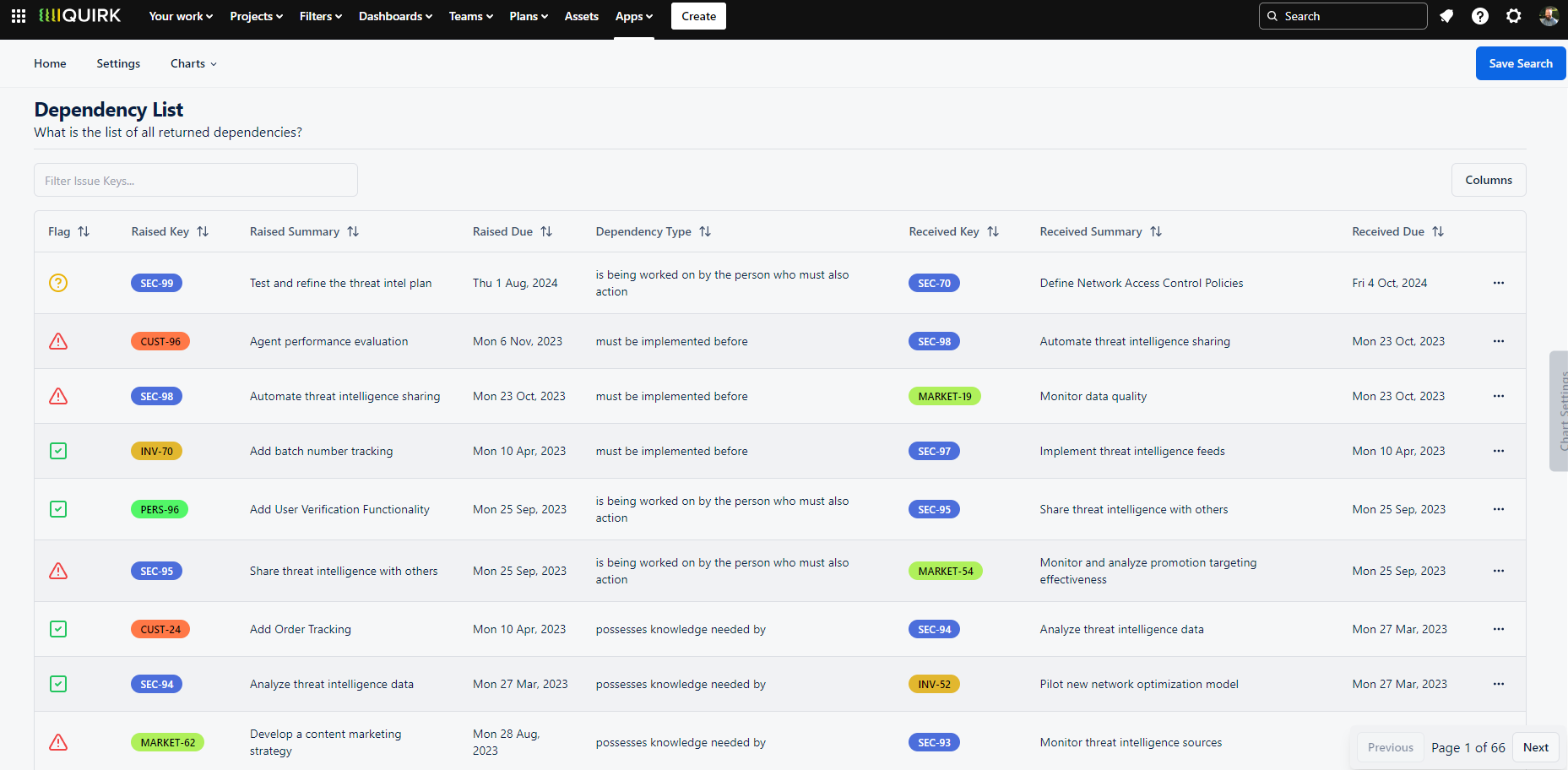
Dependency List
The Dependency List provides a straightforward, tabular view of all dependencies found in your search results. This clean, configurable table shows every issue link, with each row representing a unique dependency relationship. Select any row to explore either the raised or received issues in detail.
When to Use the Dependency List
When you need a clear, no-frills view of your dependencies, the Dependency List is your go-to visualisation. Its simple format makes it perfect for:
Running through dependencies in team meetings
Sharing dependency information with stakeholders
Quick dependency audits and reviews
Creating customised dependency reports
Review all dependencies in a clear, sortable table format with customisable columns to suit your team's needs.
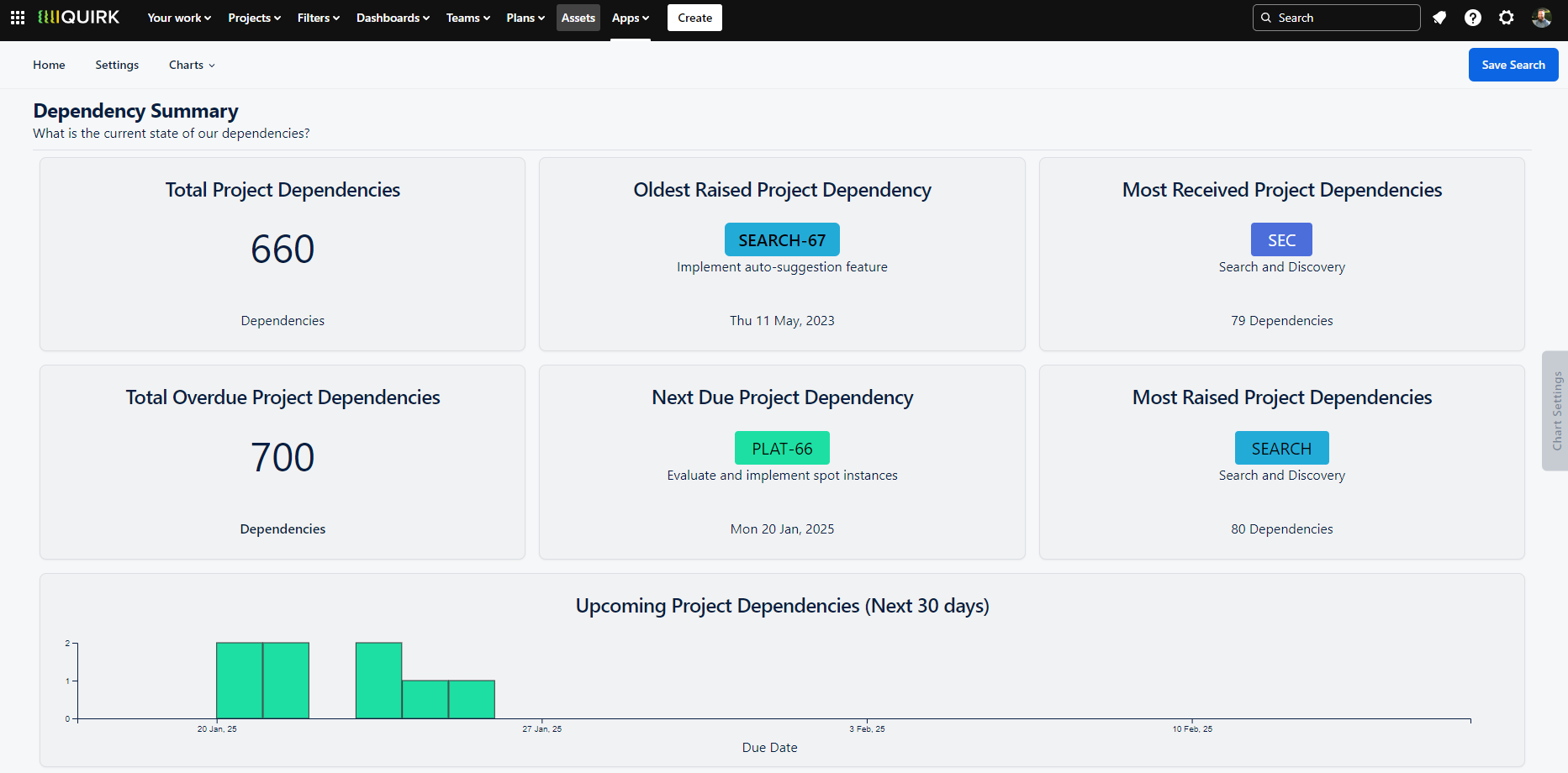
Dependency Summary Dashboard
The Dependency Summary Dashboard provides a quick yet comprehensive overview of your dependency landscape through a collection of interactive widgets. Each widget can be added to your Jira Dashboard, making key dependency metrics accessible right where you need them.
Key Insights at a Glance
Total Dependencies: Overall count of issue links
Total Overdue: Number of unresolved dependencies past their due date
Oldest Raised: Longest-standing dependency by due date
Next Due: Most immediate upcoming dependency
Most Received: Group (Project, Epic, Fix Version or Sprint) with highest incoming dependencies
Most Raised: Group with highest outgoing dependencies
Upcoming Dependencies: Visual timeline of approaching dependencies by group
When to Use the Summary Dashboard
The Summary Dashboard serves as your daily dependency management hub, offering immediate visibility into what needs attention. Teams use this view to:
Track dependency health across projects
Identify upcoming work requiring cross-team coordination
Monitor overdue dependencies
Spot teams or projects with high dependency loads
Get instant insights into your dependency landscape with customisable widgets that can be added to your Jira Dashboard.
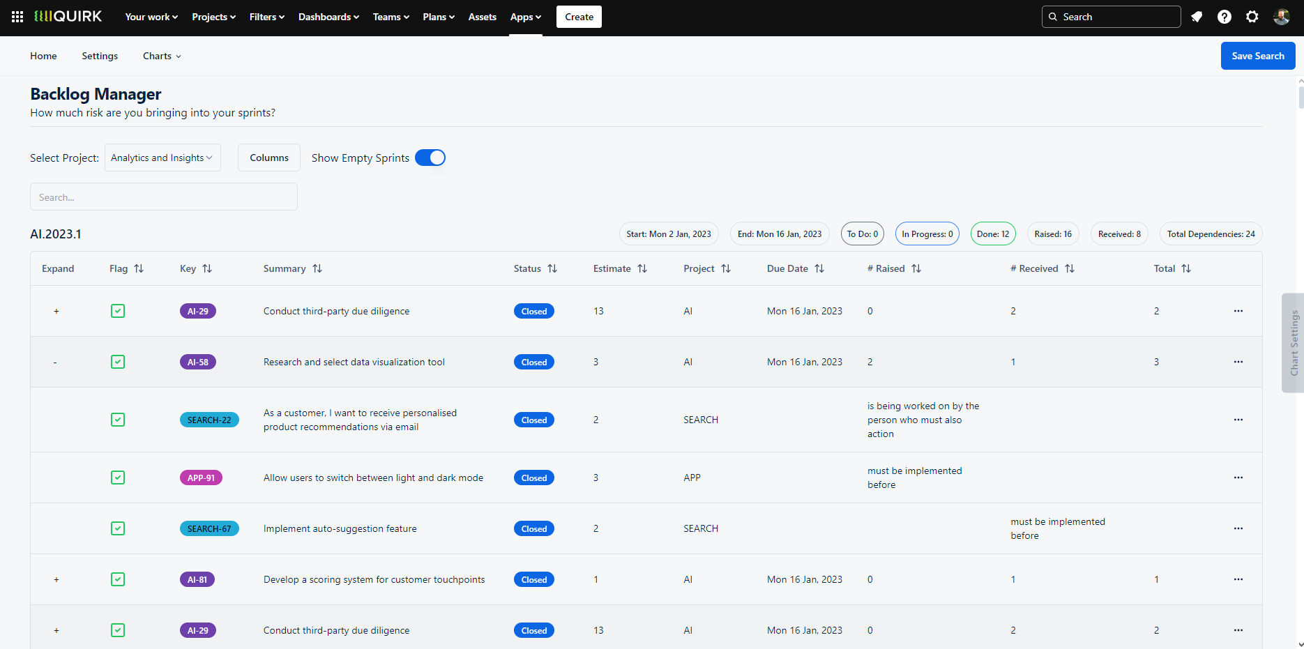
Backlog Manager
The Backlog Manager offers a dependency-aware view of your project backlogs and sprints, available exclusively in the Cloud version of Dependency Mapper. This powerful feature enhances your backlog management by surfacing dependency relationships within your sprint planning context.
Key Features
View dependencies tied to backlog items and sprint content
Filter views by specific projects using the Backlog Filter dropdown
See inbound and outbound dependency counts per sprint
Drill down into individual issues to examine their dependencies
When to Use the Backlog Manager
While Jira's native backlog view excels at issue management and sprint planning, it doesn't show how dependencies flow between sprints and teams. The Backlog Manager fills this gap by helping Scrum Masters and teams:
Assess dependency risk before committing to sprint content
Understand the full context of work being pulled into sprints
Monitor the balance of inbound and outbound dependencies
Make informed decisions about sprint capacity and scheduling
Plan sprints with confidence by understanding the dependencies tied to your backlog items and sprint contents.
Grouped Dependencies Chart
The Grouped Dependencies Chart displays dependency flows between teams in an interactive Sankey diagram format, with dependencies grouped into coloured bands by project. Click any flow line to see all related issues between those teams, or select a project band to view all dependencies within that project.
When to Use the Grouped Dependencies Chart
This visualisation helps teams analyse dependency patterns and validate team structures by revealing:
Teams with unusually high dependency loads
Mismatches between team purpose and dependency patterns
Potential team autonomy issues
Cross-team collaboration opportunities
For instance, you might expect a service desk team to have many incoming dependencies but few outgoing ones. However, a feature team showing high dependency counts in either direction might signal a need to reassess their setup for better autonomy.
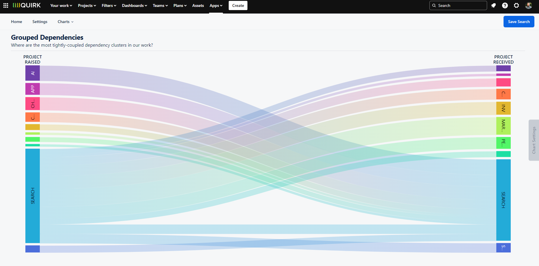
Visualise dependency flows between teams using an interactive Sankey diagram to identify patterns and optimise team structures.
Dependency Topology Chart
The Dependency Topology Chart creates a network visualisation where each issue appears as a circular node, with connecting lines representing dependencies between them. Issues are clustered into groups based on your selected criteria. Interact with individual nodes to see specific issue details, or hover over groups to view aggregate information for all contained issues.
When to Use the Dependency Topology Chart
The topology view reveals key dependency patterns through two primary indicators:
Node Size: Larger nodes indicate issues with more dependencies, helping identify critical or potentially problematic issues
Connection Density: Areas with concentrated connection lines highlight complex dependency relationships between groups, similar to traffic patterns between cities
This visualisation helps teams:
Spot issues that might need special attention due to high dependency counts
Identify groups with complex interconnections that might benefit from restructuring
Understand the overall complexity of dependency relationships across your organisation
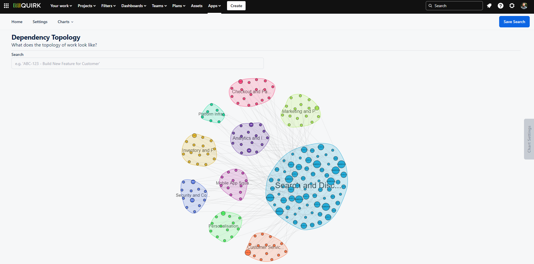
Explore dependency relationships through an interactive network diagram where node size indicates dependency count and connection patterns reveal relationship complexity.
Dependency Network Chart
Here's the consolidated section about the Dependency Network Chart:
The Dependency Network Chart offers a detailed view of individual dependencies, displaying issues as interconnected nodes with directional arrows showing their relationships. Unlike the Topology view which clusters by project attributes, this visualisation focuses on the direct linkages between issues. Hover over any node to view detailed issue information, and use the 'Show Status' toggle to add colour-coded outlines representing each issue's status category (To Do, In Progress, or Done).
When to Use the Dependency Network Chart
While many visualisations focus on simple A-to-B relationships, real-world dependencies often form complex chains where A depends on B, which depends on C, and so on. The Network view excels at revealing these intricate dependency patterns by:
Exposing the full length of dependency chains
Highlighting complex relationship webs between issues
Identifying dependencies that might need additional planning
Showing the current status of each issue in the chain
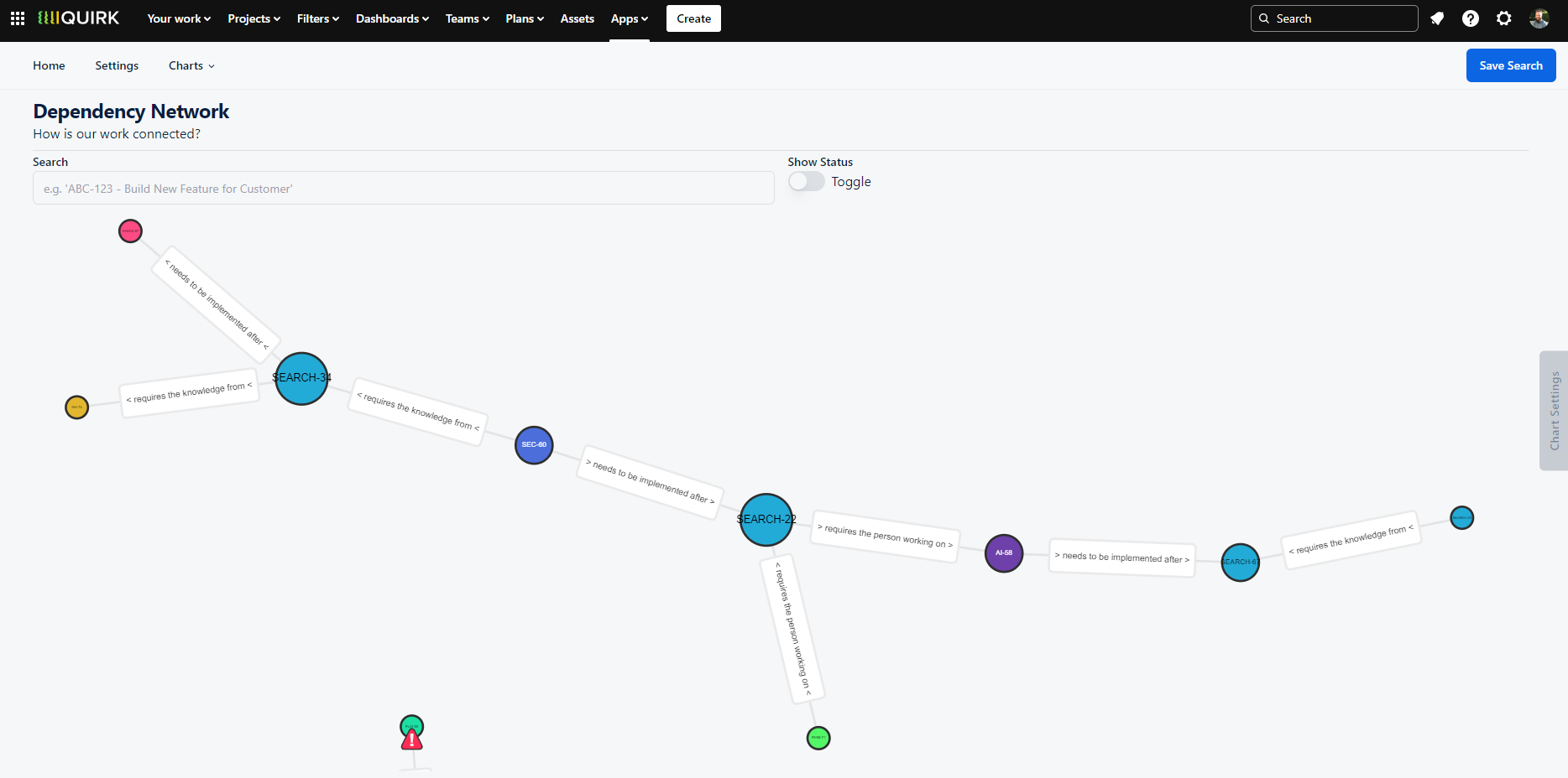
Visualise complex dependency chains with directional relationships and status indicators to better understand work dependencies.
Individual Dependencies Chart
The Individual Dependencies Chart creates a circular visualisation where dependencies appear as connecting lines between coloured arcs, with each arc representing a project grouping. This interactive view lets you drag and zoom to explore connections, with clickable elements that reveal more detail - select any dependency line to open the related issue, or click an arc to see all dependencies within that project.
When to Use the Individual Dependencies Chart
Just as teams naturally huddle to identify key connections before breaking into formal planning sessions, this visualisation helps teams quickly spot critical dependencies and collaboration points. The circular layout particularly helps teams:
Identify areas of high dependency traffic between groups
Determine which teams need to coordinate closely
Plan resource allocation for cross-team sessions
Spot isolated teams or those with minimal dependencies
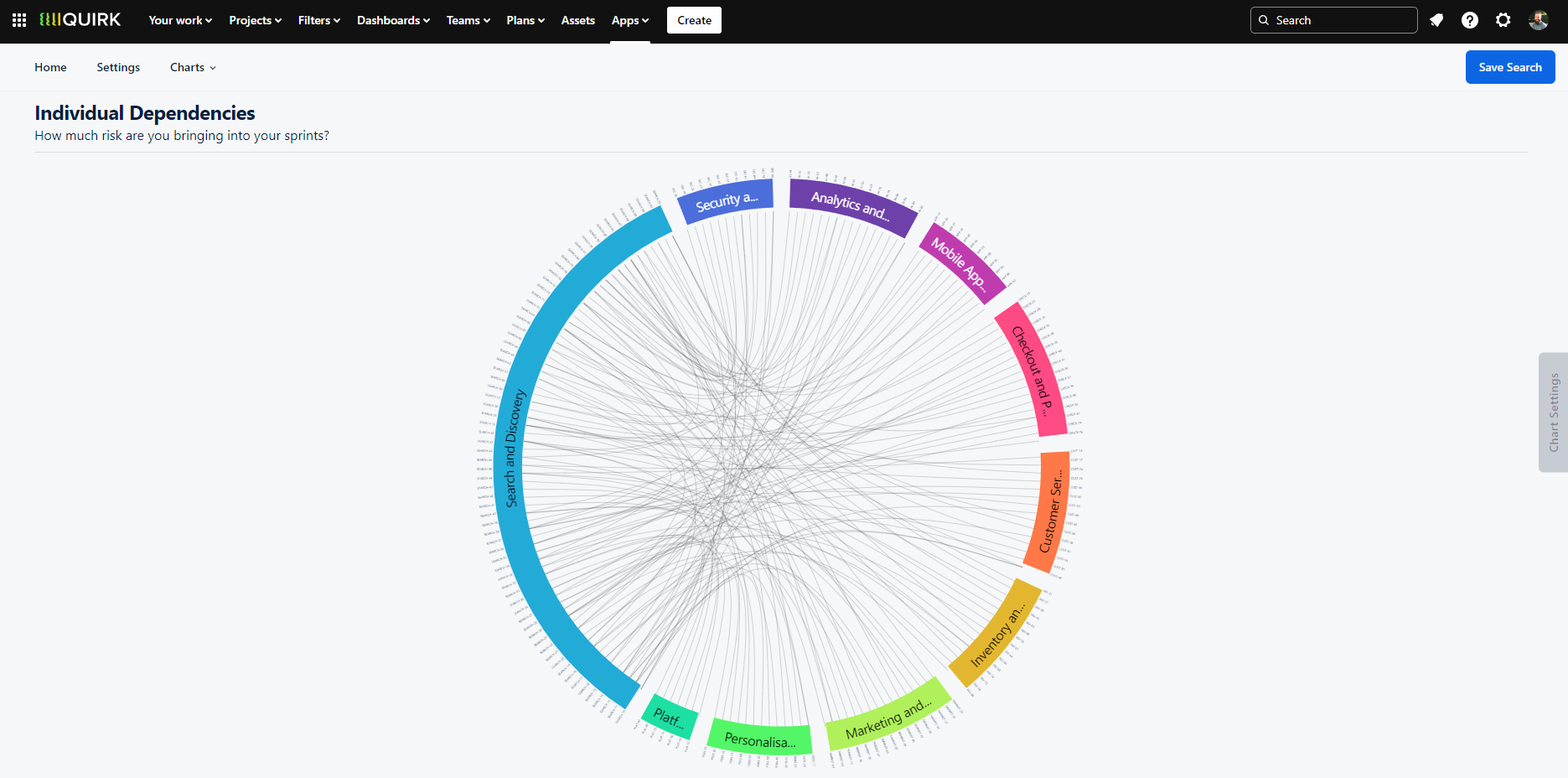
Explore team interconnections through an interactive circular layout that highlights dependency patterns between groups.
Time to Resolve Chart
The Time to Resolve Chart analyses the lifecycle of dependencies by measuring the duration between an issue link's creation and its resolution (when the issue moves to Done status). This analysis is presented through two complementary views:
Two Key Perspectives
Frequency Chart (PDF): Shows the count of dependencies resolved within specific timeframes (e.g., 10 dependencies resolved in exactly one week)
Cumulative Frequency Chart (CDF): Displays the percentage of dependencies resolved within progressive time periods (e.g., 40% of all dependencies resolved within one week)
When to Use the Time to Resolve Chart
This visualisation is particularly valuable for teams focused on delivery performance and SLA compliance. It helps teams:
Understand typical dependency resolution timeframes
Make informed delivery commitments that account for dependency risks
Identify when dependencies need expediting to meet SLA targets
Set realistic expectations for work involving cross-team dependencies
For instance, if historical data shows dependencies typically take a month to resolve, but you have a one-week SLA, you'll know to fast-track dependency resolution to meet your commitment.
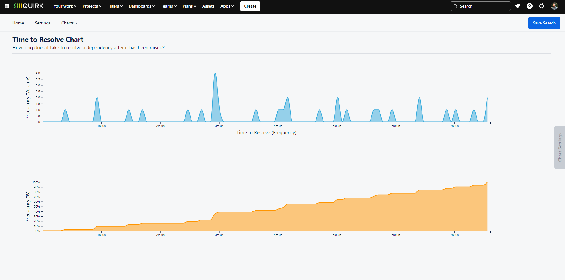
Analyse dependency resolution patterns with statistical visualisations showing both frequency and cumulative resolution times.
View Chart - Dependency CFD
The Dependency Cumulative Flow Diagram (CFD) tracks the total number of dependencies in your system over time, visualising the flow of incoming and resolved dependencies. This chart helps teams understand their dependency health through trend analysis.
When to Use the Dependency CFD
Just as teams monitor their work intake versus completion rates, tracking dependency flows is crucial for maintaining system stability. The CFD helps teams:
Assess dependency management effectiveness
Monitor system stability and predictability
Identify trends in dependency accumulation
Make data-driven decisions about intervention points
A healthy system typically shows balance between incoming and resolved dependencies. When the incoming rate exceeds resolution rate, complexity and risk increase exponentially. Conversely, while a higher resolution rate is desirable, teams need to maintain enough incoming work to keep their delivery pipeline active.
Managing System Health
Rising trend lines indicate accumulating dependencies requiring attention
Parallel trend lines suggest a stable, predictable system
Declining trends show successful dependency resolution
Sharp changes warrant investigation and potential intervention
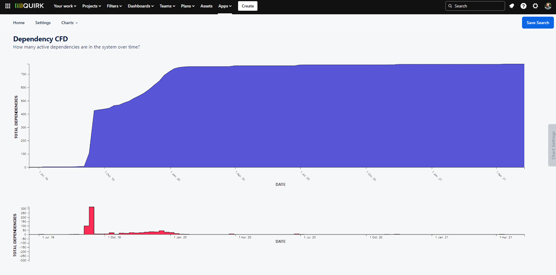
Monitor your dependency health over time with a cumulative flow diagram showing trends in dependency creation and resolution.