How To Guide
How to find the Scrum Master Assistant app
Navigate to the Scrum Master Assistant app through the top nav bar
Apps > Dependency Map

Input Search Query
Input JQL Query
The JQL Query is what governs the scope of the end visualisation, and as such is important to ensure you only query relevant tickets that you want included in the end result.
e.g. If you wanted to look for all stories in the ABC project that were resolved before 2019, your initial JQL query would be Once that initial query has been completed, the app will then search for all the dependencies within that query. In this example, there may be 300 Jira issues returned, with 100 dependencies identified. The Scrum Master Assistant then creates separate data sets to create two unique visualisations; one showing the individual dependencies themselves, and another that shows a heatmap of grouped dependencies. |
|---|
Or Select Jira Filter
Alternatively, select one of your existing Jira filters that you’ve saved using the dropdown and it will auto-populate the JQL Query field.
After you’ve input your query, a notification will tell you how many initial results were found (e.g. 125 results). When the ‘Get Data’ button is clicked the app will then find all descendants of those 125 results, and then all ancestors of those descendants for full traceability (i.e. top-down, then bottom-up).
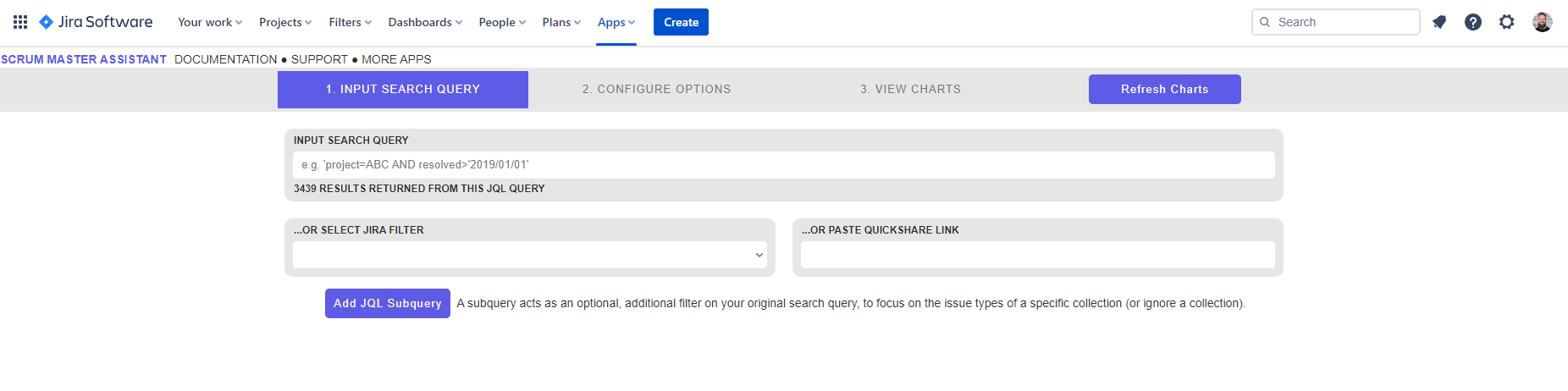
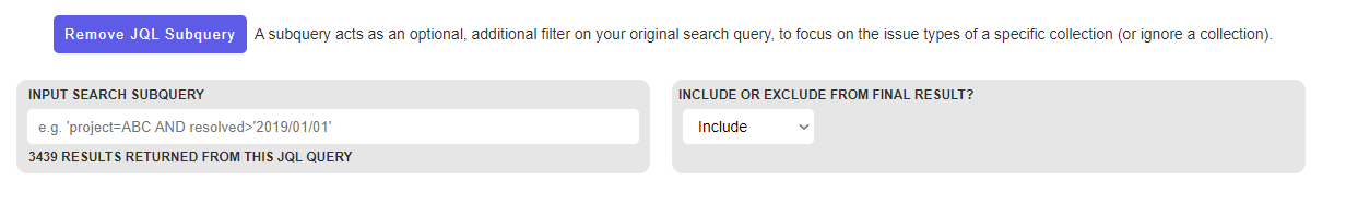
Add JQL Subquery (Optional)
The ‘Add Subquery’ button is an optional filter that can be applied to further limit the results returned by the JQL query. This is to overcome the limitation of JQL which offers certain functions that can’t be filtered further.
e.g. Say you were the owner of a particular Project backlog, called ABC, and you wanted to look at all of the dependencies between your Project and that of another backlog, called DEF. For your ‘Initial Search Query’ you might start with the JQL Query To get around this, we can use the ‘Input Search Subquery’ field to handle this for us, by allowing us to input a second JQL query that specifies *exactly* what should be included from the original query. In our example, if we have a search query of Alternatively, if there was a third project, say GHI, that we specifically wanted to *exclude* from the final result we could have a search query of |
|---|
Configure Options
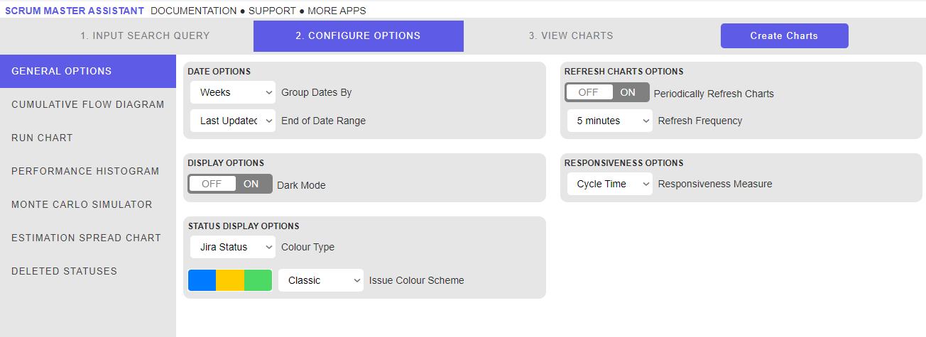
General Options
Group Dates By - Determines what date grouping is applied to charts that use a time-based metric (e.g. cycle time)
End of Date Range - Determines what the axis range is for time-based charts
Dark Mode - Toggles the Dark Mode or Light Mode themes of the app
Colour Type - Determines whether status' are coloured by the Jira colour scheme (i.e. based on To Do, In Progress or Done) or a custom scheme
Issue Colour Scheme - See Colour Type
Periodically Refresh Data - When enabled, a full refresh of the data will be performed in the background after the initial charts are generated
Refresh Frequency - Determines how often the data is refreshed
Note: Be mindful that each refresh involves making several API calls, so ensure the refresh frequency is ‘sensible’! |
|---|
Responsiveness Measure - Determines whether Cycle Time or Lead Time is used when generating charts
‘Cumulative Flow Diagram’ Options
Display Zero WIP Values - If toggled, removed status' that have 0 issues from the tooltip for that particular time period
‘Run Chart’ Options
Run Average Colour - Determines the colour theme for the average responsiveness measure
Run Moving Average Colour - Determines the colour theme for the moving average responsiveness measure
‘Performance Histogram’ Options
Performance Histogram Bar Colour - Determines the colour theme for the histogram bars
Performance Histogram Line Colour - Determines the colour theme for the histogram line
‘Monte Carlo Simulator’ Options
Monte Carlo Simulator Line Colour - Determines the colour theme for the Monte Carlo simulation line
‘Estimation Spread Chart’ Options
Estimation Spread Status Colour Theme - Determines the colour theme for the Estimation Spread status'
Deleted Status' Options
When the charts are initially generated, the API may return status' that were deleted from your Jira instance. Unfortunately, there is no way to understand what Status Category those deleted values were, so they will appear here to be mapped to the corresponding charts. Note this may require refreshing the charts a second time to see the updated results.
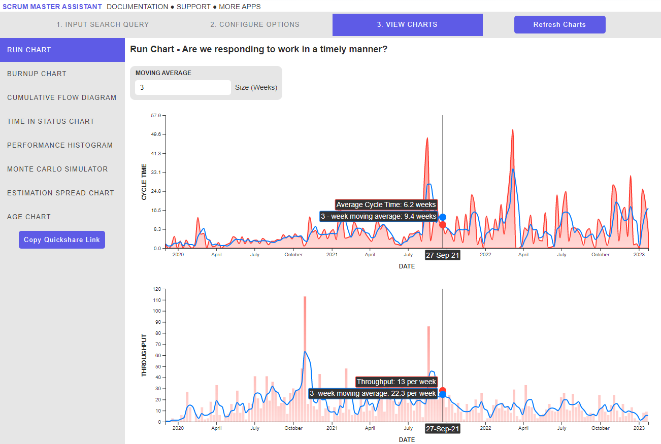
View Chart - Run Chart
This view can be seen after clicking the ‘Get Data’ button and navigating to Run Chart on the left side menu.
The Run chart displays the selected responsiveness measure (Cycle Time or Lead Time) parallel to the Throughput measure.
Additional Buttons / Features
Moving Average - Adjusts the number of periods used to calculate the moving average values
Copy Quickshare Link - Generates a string of text that can be shared with others to replicate the chart you’ve created
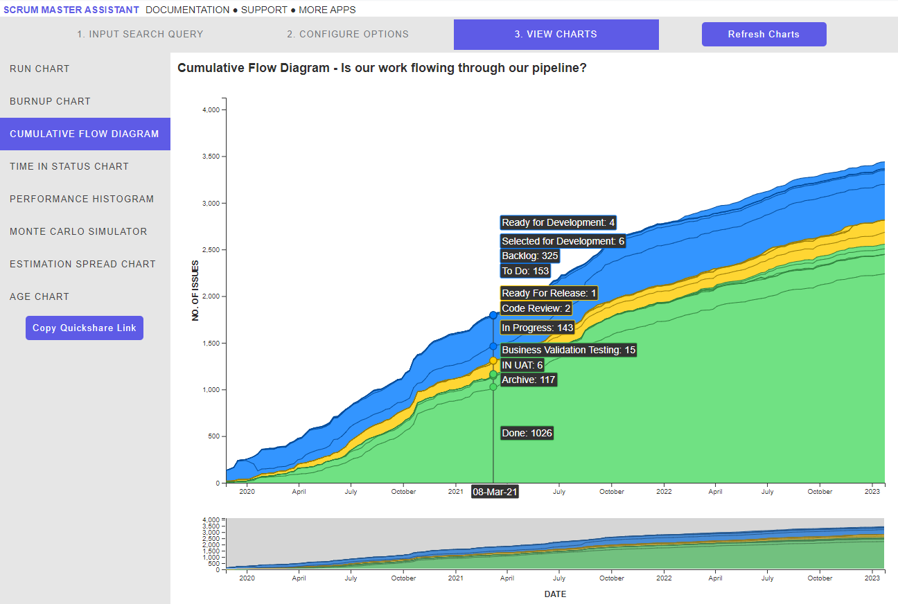
View Chart - Cumulative Flow Diagram
This view can be seen after clicking the ‘Get Data’ button and navigating to Cumulative Flow Diagram on the left side menu.
The Cumulative Flow Diagram shows the running cumulative total issues for each status, ordered top-to-bottom by To Do > In Progress > Done Status Categories.
Additional Buttons / Features
Copy Quickshare Link - Generates a string of text that can be shared with others to replicate the chart you’ve created
Date Brush - Underneath the main CFD chart, allows the user to drag and select the date range they’d like to focus on
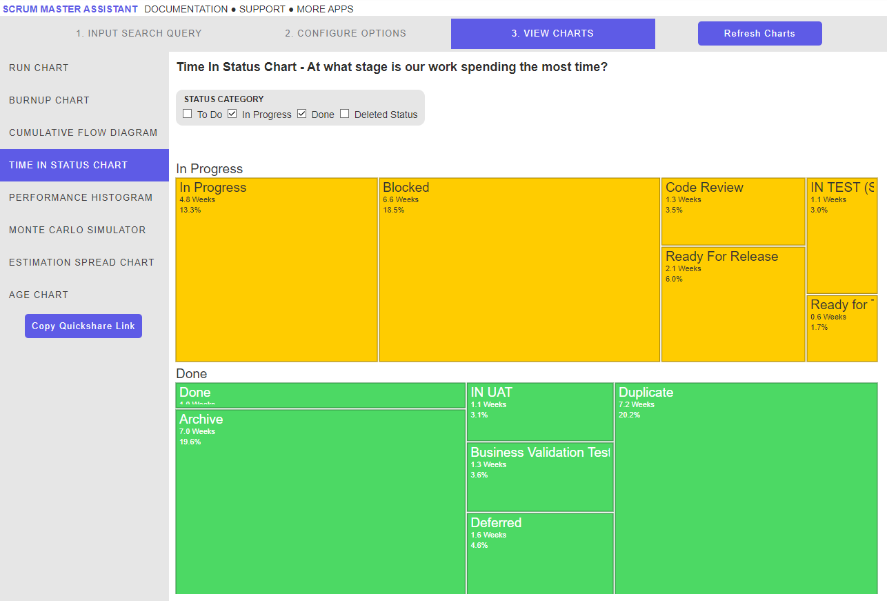
View Chart - Time in Status Chart
This view can be seen after clicking the ‘Get Data’ button and navigating to Time in Status Chart on the left side menu.
The Time in Status chart shows the average Time in Status for each recorded Status, grouped by Status Category arranged in a tree diagram format. The bigger the average, the bigger that particular status will be relative to other values on the chart.
Additional Buttons / Features
Copy Quickshare Link - Generates a string of text that can be shared with others to replicate the chart you’ve created
Status Category - Allows the user to filter the chart by Status Category
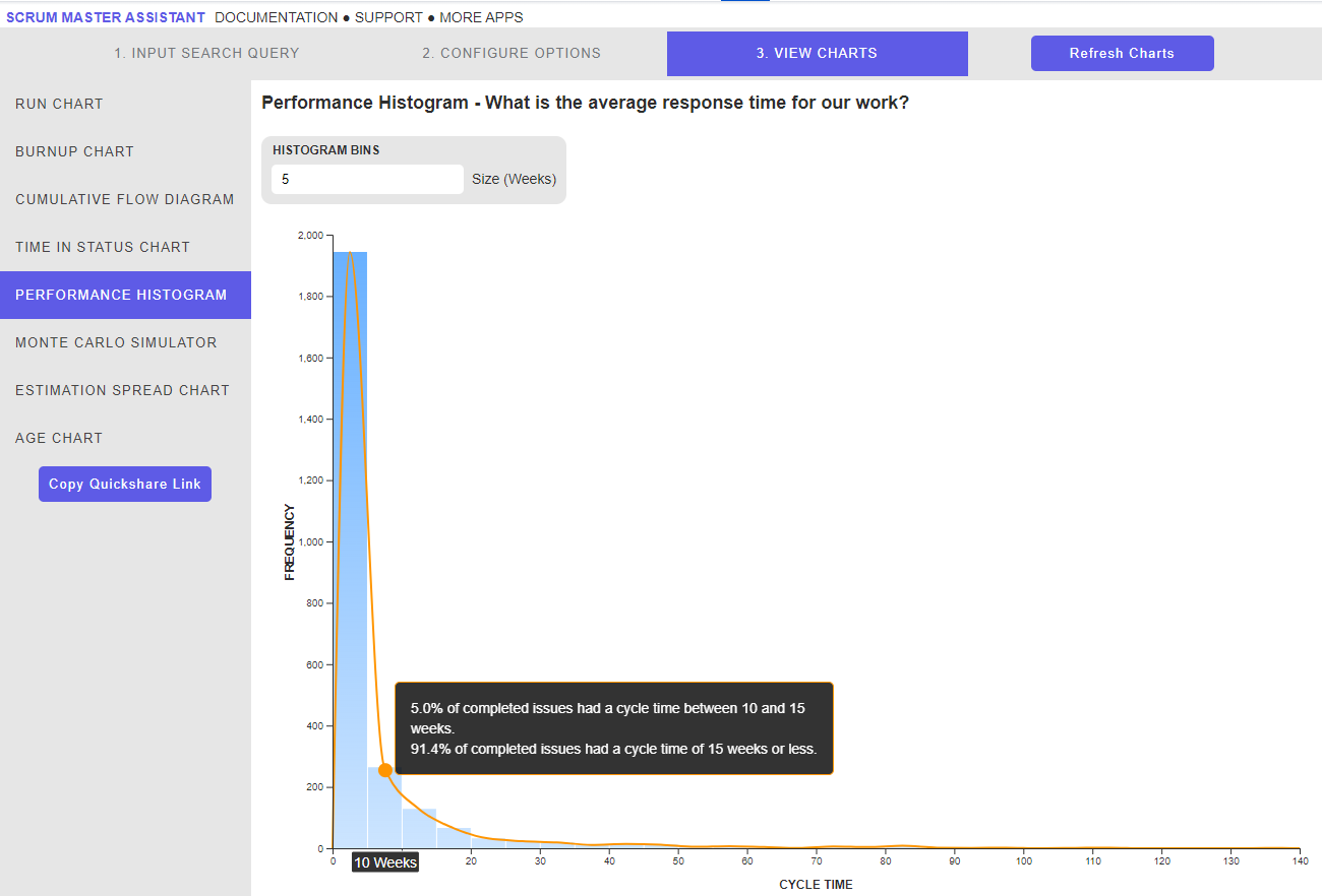
View Chart - Performance Histogram
This view can be seen after clicking the ‘Get Data’ button and navigating to Performance Histogram on the left side menu.
The Performance Histogram chart plots the selected responsiveness measure (Cycle Time or Lead Time) onto a histogram.
Additional Buttons / Features
Copy Quickshare Link - Generates a string of text that can be shared with others to replicate the chart you’ve created
Histogram Bins - Allows the user to customise the bin size of the histogram based on the Date Grouping option selected
View Chart - Monte Carlo Simulator
This view can be seen after clicking the ‘Get Data’ button and navigating to Monte Carlo Simulator on the left side menu.
The Monte Carlo Simulator chart displays the outputted histogram of a Monte Carlo Simulation performed on the returned issues by the JQL, depending on the options selected.
In short, a Monte Carlo Simulation is a forecasting tool that uses historical performance to simulate a high volume of semi-randomised outcomes depending on the number of issues, or time period, the user wants to forecast. These outcomes are then grouped and summarised into a histogram that plots the overall confidence of reaching that particular target.
Additional Buttons / Features
Copy Quickshare Link - Generates a string of text that can be shared with others to replicate the chart you’ve created
Fixed - Allows the user to simulate based on Scope or Time
No. of Issues / Number of <date grouping> to simulate - Allows the user to configure how many issues, or what period of time, they want to run the simulation against
% Focus - If you want the simulation to take into account a split focus, or different resourcing profile to simulate against based on historical performance, the user can adjust that percentage here
No. of simulations - The volume of simulations the Monte Carlo algorithm runs against

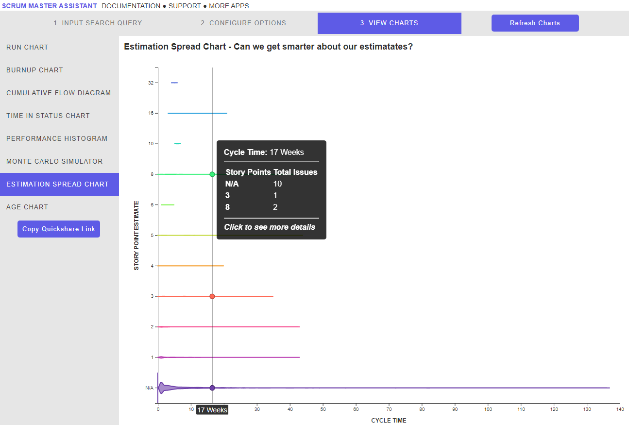
View Chart - Estimation Spread Chart
This view can be seen after clicking the ‘Get Data’ button and navigating to Estimation Spread Chart on the left side menu.
The Estimation Spread chart plots the volume of Story Point estimates against the responsiveness measure (Cycle Time or Lead Time) selected by the user.
This chart is useful to highlight the overall efficiency of an estimation method. If there is heavy overlap with certain Story Point values, it might be worth consolidating the estimation options as part of your continuous improvement efforts.
Additional Buttons
Copy Quickshare Link - Generates a string of text that can be shared with others to replicate the chart you’ve created
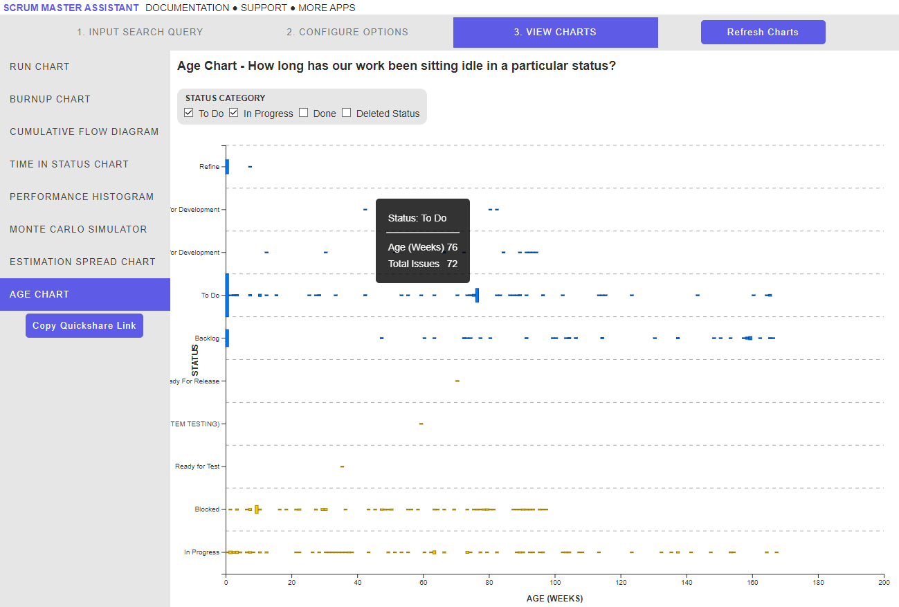
View Chart - Age Chart
This view can be seen after clicking the ‘Get Data’ button and navigating to Age Chart on the left side menu.
The Age Chart plots the frequency of various status' returned by the JQL query against the time in status, depending on the date grouping option selected by the user.
This chart is useful for highlighting the overall predictability and consistency of issues depending on their status. Ideally there should be tight clustering of frequencies for each status, with long tails being a sign of an unpredictable system.
Additional Buttons
Copy Quickshare Link - Generates a string of text that can be shared with others to replicate the chart you’ve created
Status Category - Allows the user to filter the chart by Status Category